“Music is the thousandth of a millisecond between one note and another; how you get from one to the other- that’s where the music is.”
-Isaac Stern
The Goldberg Variations is a piece of music originally written for harpsichord and played in present day on piano. It was composed by Johann Sebastian Bach and published in 1741. Legend has it that its name comes from Johann Gottlieb Goldberg, the harpsichordist for whom Bach wrote the piece.
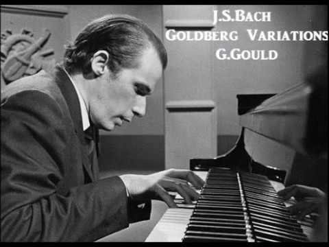
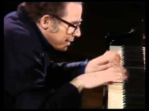
Although there are several notable recordings, those of Glenn Gould easily belong in anyone’s top selection due to their technical rigor and interpretive depth. He made two recordings, one in 1955 and another 26 years later in 1981. It was his last recording before his death in 1982.
This is especially fascinating because the two recordings could not be more different. 1955 is impressive and virtuosic while 1981 is meditative and introspective. I often start with this side by side comparison when demonstrating to my music students the boundless breadth of emotional interpretation great classical compositions offer us.
Glenn Gould - Goldberg Variations (1955)
Glenn Gould - Goldberg Variations (1981)
Even though I’ve listened to this piece hundreds of times since childhood, it still has more to teach. Today, however, I’d like to talk about the first two notes. That’s all. And I promise, this has something to do with design.
If you don’t read music, the right hand simply plays the same note (G) twice. So what’s so interesting about that?! If you compare the 1955 with the 1981 recording you’ll notice that 1981 is quite a bit slower. As a result, the space between the strike of the two notes is longer and the first note is allowed to linger, leaving you wondering what comes next. Suddenly we’re acutely aware that this isn’t just two notes at all - it’s three things - a note, its resonance that occupies the silence after the note, then another note with the space holding all the power of how the two notes are heard. When the space is so short it isn’t noticeable like in 1955 - the opening phrase sounds nonchalant, almost flippant. In 1981, there’s solitude, like the echo of a gong hanging in the air in a stone courtyard.
Maybe the space isn’t a result of the chosen tempo at all. What if we considered the space more than a consequence and saw that it is its own element, with its own character?
Then one might even say space is what determines pace. Get it?
This got me thinking about the role of tempo in interior design. After all, upon entering a home, we encounter objects in a particular order and experience them in a certain rhythm - that rhythm determined by the physical space between them. The same chair at the front door when you walk in after a long day will feel and be used differently than if it were by the bedroom window. It’ll also look different in a different context, in different light and surrounded by different things.
Takeaways:
If you’re deciding on whether a piece or element is right for you, think about when and how you come across it in your day. Then how you depart from it. Don’t just focus on whether you like how an object looks, as if it exists only in the vacuum of the website’s photo. I like to walk through a space over and over in the order, pace and direction the piece will be encountered. I imagine using it, putting myself in the frame of mind I will be in when I do.
Don’t be afraid to repeat the same elements throughout. In fact, I encourage you to! It’s an effective strategy to build cohesion and it’s fascinating to see how each piece can be nearly unrecognizable in different contexts.
A Closer Look
For a further look into how space can be used to create rhythm, consider the following design by Joseph Dirand.
Joseph Dirand | Varenne, Paris
I see three dominant rhythms in this room. The first is the steady repeat of the color field artwork. However, while the space between each is the same, Dirand plays with their respective weights. Certain colors give a feeling of relief, while others may be more mysterious, one even feeling to me like a moment lost in limbo. Like a phrase of music, the rhythm of the notes may be constant, yet the timbre (or color) of the tones can change, creating a different dimension altogether.
The second rhythm comes from the wainscoting. A pattern of “long, space, short, space, long, space, short, space” grounded more permanently in the interior architecture.
Finally, the third rhythm is the very permanent and anchored planes of the walls, which change at the corner.
If this were a piece of music, the artwork would be the upper voice, the wainscoting the middle, and the walls the sustained baseline. Rather than try to force the artwork in line with the other two rhythms, which would be exceedingly obvious, he overlays it with more complexity. To the immediate eye, it does not seem to center over panels nor line up with them in any way. However, we do know that if all three rhythms are perfectly repeating, eventually the starting point of the cycle will be reached and it will begin again. This is simply their least common multiple.
Keeping this in mind, let’s analyze how these three patterns work together. Taking pixel measurements of the image,
We immediately see that they are all multiples of 6! There may be some inaccuracy due to slight perspective in the photo or measuring a lower resolution, but this is an exploration of visual perception rather than mathematical accuracy. Some quick calculation reveals that the artwork and wainscoting repeat their cycle for every 19 panels of art, and 11 sets of panels (one set consists of one long, one short).
Unfortunately, we do not know the full wall dimensions of the room so we cannot find how it cycles with the artworks, but that’s ok. We have enough here to talk about how this all relates to design.
So what does this all mean? Why go through all this and not just center everything? Aesthetically, our minds more easily register patterns that repeat themselves often. The longer a stretch of elements goes without returning to the start, the further from our comfort zone it gets. Dirand uses rhythm here to create a degree of uncertainty. Subtle as it is, it takes an interior architecture that is sturdy, resolute and predictable and throws it off just enough to be interesting - even whimsical.
-MM


